

Select charts for summaries
Up to 3 charts can be defined for each summary. This allows a graphical view of critical data on a summary.
The rows or lines in the summary represent one axis (this is fixed by the summary) and these can be charted against one or more of the fields (columns) on the summary. For example with the Pattern summary one axis is the set of patterns and the fields are items such 'Number of cross cuts', 'Number of Rip cuts ... per pattern. At the Summary screen:-
● Select: Settings - Chart settings
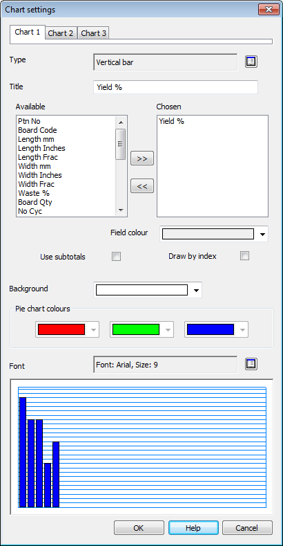
● Click on a tab to choose the chart so set up.
Select a chart type and title for the chart.
 Use the list box to select a
chart type
Use the list box to select a
chart type
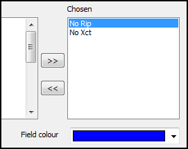
The 'Available' box list the fields on the summary and the 'Chosen' box lists the fields selected for the chart. Select a field in the 'Available' box and use the cursor buttons to move the field to the 'Chosen' box and vice versa.
Field colour
Assign a colour for each item in the chart.
- Select the item in the 'Chosen' box and select the 'Colour'. Repeat for each item in the Chosen box.
 Sub totals - check this box
to chart based on the sub-totals in a summary rather than the items in
the summary.
Sub totals - check this box
to chart based on the sub-totals in a summary rather than the items in
the summary.
Draw by index
Draw by index - check this box
to box to group the chart items
Only applies to Bar charts
In the following chart the index items (Rip and Cross cuts per pattern) are grouped by the index so rip cuts and cross cuts are shown separately and there are two indexes along the foot of the chart.
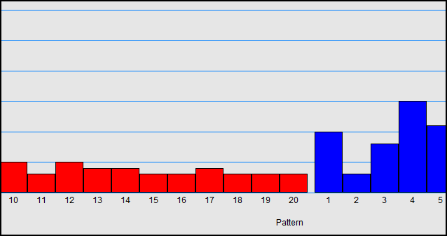
Alternatively the items are not grouped.
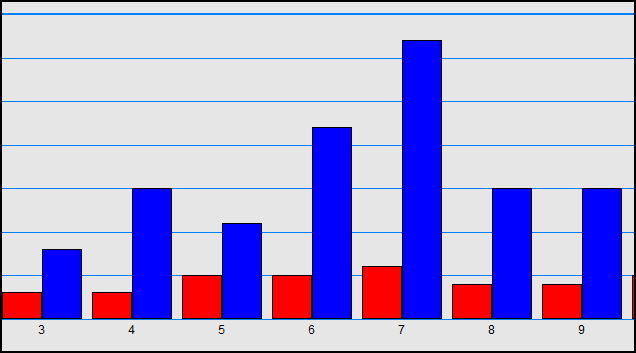
Typically where there are several items on a chart the items
Background - sets the colour of the chart background
Pie chart colours - set the basic colours for a pie chart. The program uses these colours in sequence to show the items on a pie chart.
Font - set the font size and style for the text on the chart
The preview shows how the chart appears. It is an example and is NOT based on the current data in the run.
See the help topic: Review runs - report layout and settings
![]()